






Download
iLearn application
Elevate Your Financial Knowledge with the
ICICI Direct iLearn App




Candlestick charts has been around for hundreds of years. They are often referred to as "Japanese candles" because the Japanese would use them to analyze the price of rice contracts. A rice trader named Homma from the town of Sakata deserves much of the credit for candlestick development and charting. Over many years of trading, it's likely that his original concepts were altered and improved, eventually leading to the candlestick charting system that we use today. But many of the guiding principles remained the same throughout the years:
To understand the need and power of candlestick charts, let’s analyse the price action movement of TCS over the last month:
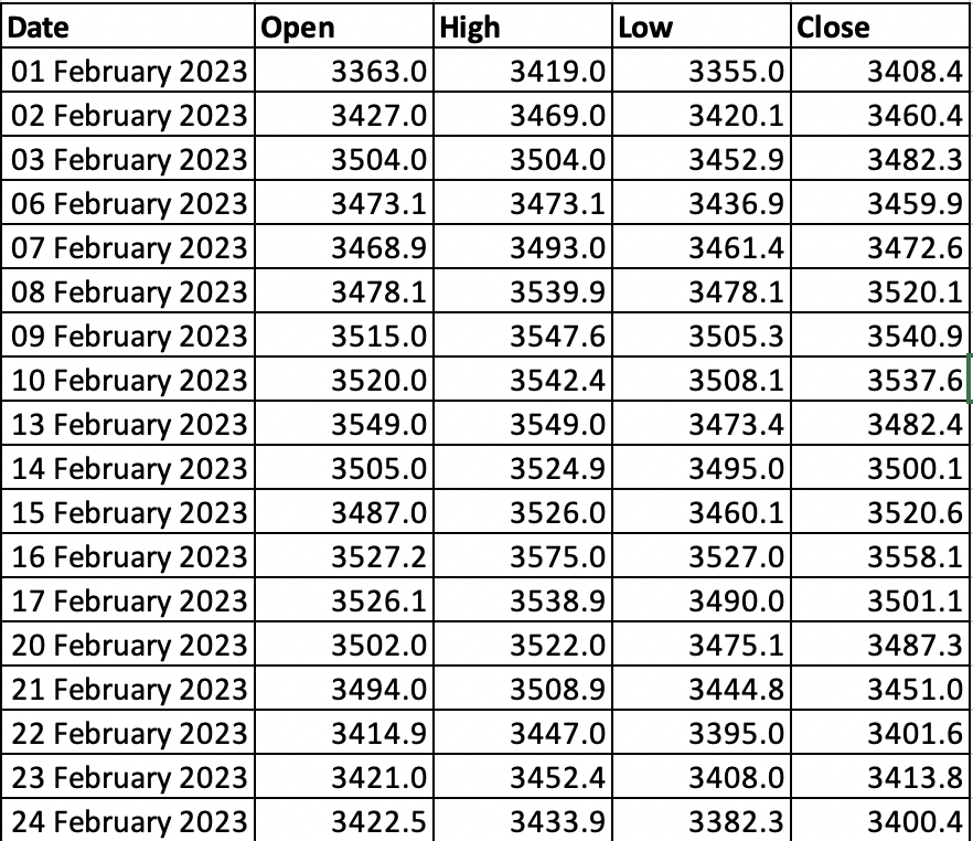
The table above contains the daily reported price movement of TCS from 1st Feb 2023 to 24th Feb 2023.
You have 2 minutes to come to a conclusion by just looking at the above table. What is your analysis? Could you understand the price movement, or could you observe any pattern?
If you are not a maths genius, I would say it would have been very difficult for you to draw any conclusion from all these numbers.
Let’s give it another go, but this time we’ll use the figure below:
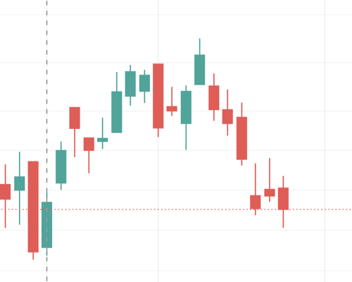
The table and the candlestick chart both are representing the same information: Daily Price movement of TCS in Feb’23, but notice how much easier it is to process information when it is in the form of a chart or picture rather than old boring numbers in a table.
Just a look at the chart, you can easily figure out the road map of where the prices have been and get a sense of the trend the prices have been following in the last 1 month.
Simply put, candlesticks patterns are a way of communicating information about how price is moving. As the name suggests, the candlesticks charts resemble a simple candlestick with a body and wick.

A candlestick displays the open, close, high and low price of the underlying asset for a time period. In a typical candlestick chart, each candlestick represents a specific time period, such as a day, a week, or an hour. The colour of the candlestick can indicate whether the price of the asset rose or fell during that time period. A green or white candlestick indicates that the price rose, while a red or black candlestick indicates that the price fell.
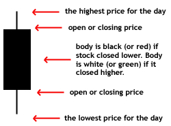
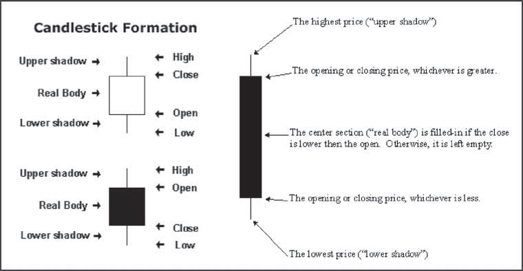
Simply, a candlestick has 5 factors; High, low, close, open and the body. Let's understand these terms using the same example of TCS.
On 1st Feb 2023, TCS’s stock opened at NSE at Rs.3,363. During the day, the price traded in the market naturally deviated from its open price, made a high of 3,419 and even touched 3,355, which was the lowest price at which TCS traded on that day. Finally, when the market closed, TCS's price settled at a close price of 3,408.35.
To sum it up, on 1st Feb 2023, TCS made a :
Open:3,363
High: 3,419
Close: 3,408.4
Low:3,355
The body of the candle or the box represents both the opening and the closing price. If the stock closed at a higher price than it opened, the body is green(white). Conversely, if the closing price falls below the opening price, the body is red (black).
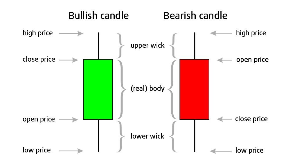
The colour and the length of the body and the shadows/wick convey a snapshot of who’s winning the battle between the bulls and bears.
The thin vertical bars/lines above and below the body of the candle represent the price extremes of the trading session and are called shadows/wicks. The line above the body is called the “upper shadow/wick,” and the line below the candle is called the “lower shadow/wick”. The tip of the upper wick in a bullish candle is the high price, and the tip of the lower wick in a bullish candle is the low price of the trading session of the stock.
Individual candlesticks can take a variety of forms, some have long bodies, some short wicks/shadows, some have short bodies with long wicks, and so on.
The colour of the body, the size of the wick and the body and where the candle sits relative to the wick tell a lot about the price action that occurs over the time period represented by the candlestick.
Taking the example of the third candlestick in the above TCS chart, we see that this candlestick has almost no upper wick; this, along with the red body, indicates that TCS opened near the high of the day and closed near its lowest price as the lower wick is too far from the closing price.
Whereas the second candlestick in the chart has a relatively small green body and longer wicks, indicating that the price range throughout the day was much greater than the difference between the opening and the closing prices.
Therefore, you can see how well even a single candlestick communicates the “market sentiment”: whether (and to what extent) bears or bulls were in control and how far traders managed to push prices in both directions.
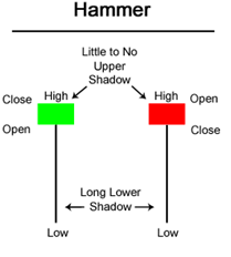
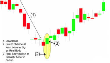
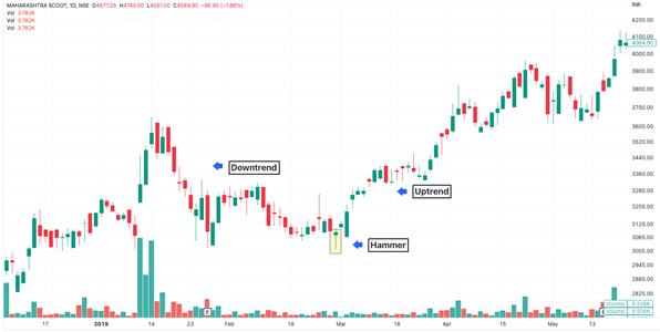
Hammer is a bullish trend reversal single candlestick pattern that forms after a decline in trend. Therefore, it indicates a change in trend, i.e. from a downtrend to an uptrend. It is so named because it hammers out the bottom. The resulting candlestick has a long lower wick with a short body and little to no upper wick.
Market view
The long lower wick's low suggests that sellers pushed prices lower throughout the session. The strong finish, on the other hand, suggests that buyers recovered to end the session strongly. Even though it might seem like enough to proceed, hammers need more bullish support. The low of the hammer indicates that there are still many sellers. Before taking action, there needs to be more buying pressure, ideally on an increasing volume. A gap up or a long green candlestick could provide such confirmation.
Criteria
Trade setup
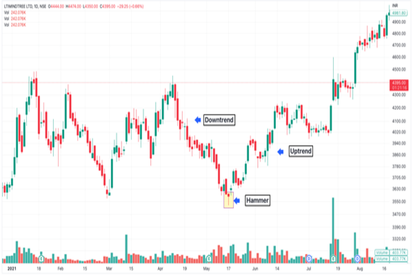
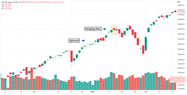
The below examples are taken from the daily timeframe chart of LTI Mindtree and Maharashtra Scooter
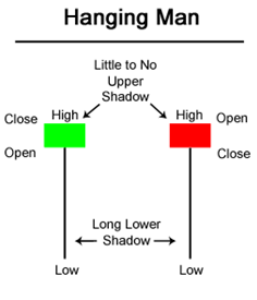
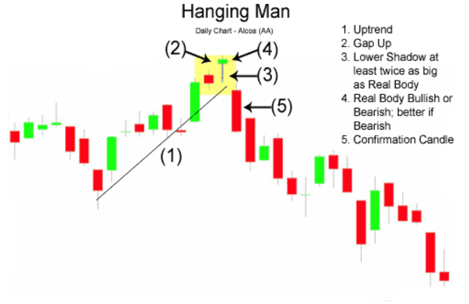
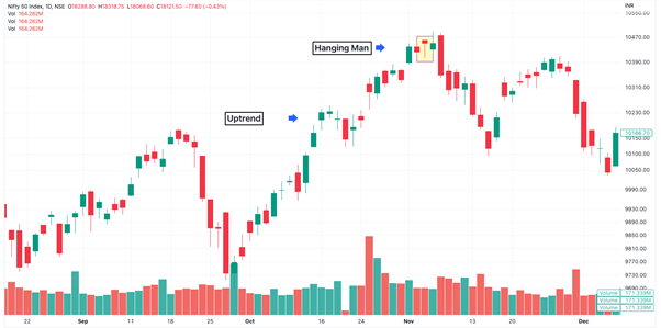
The "hanging man" pattern refers to a candle that has the same shape as a hammer, except that hammers occur in downtrends and the hanging man pattern occurs in uptrends.
Market view
The hanging man pattern is formed when bulls push prices higher at the open price of a trading session but bear then enter the market and push prices lower. The bulls eventually manage to push prices back up, but they can't maintain the momentum, and prices close near the open. This creates the small real body and long lower wick that characterizes the hanging man pattern.
The hanging man pattern is considered a bearish reversal pattern because it suggests that the bulls are losing control and bears are taking over. It is often interpreted as a signal that the uptrend is weakening and a downtrend may be starting.
Criteria
Trade setup
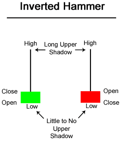
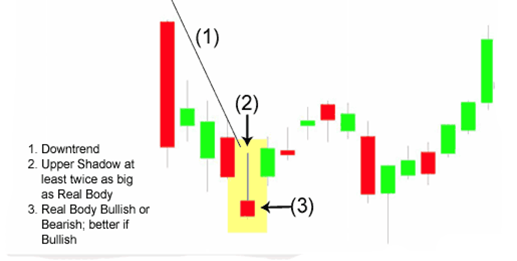
An "inverted hammer" is a bullish candlestick pattern that can potentially indicate a reversal in a downtrend. The candle has a small body, a long upper wick and a small or non-existent lower wick. This candlestick marks potential trend reversals but requires confirmation before action.
Market view
Inverted Hammers indicate a possible trend reversal or support levels. The long upper wick, which follows a decline, signals buying pressure during the session. The bulls, however, were unable to maintain this buying pressure, and prices closed substantially below their highs, resulting in a lengthy upper wick. This failure calls for bullish confirmation before taking any further action. Bullish confirmation could be provided by an Inverted Hammer supported by a gap-up or a long green candlestick with high volume.
Criteria
Trade setup
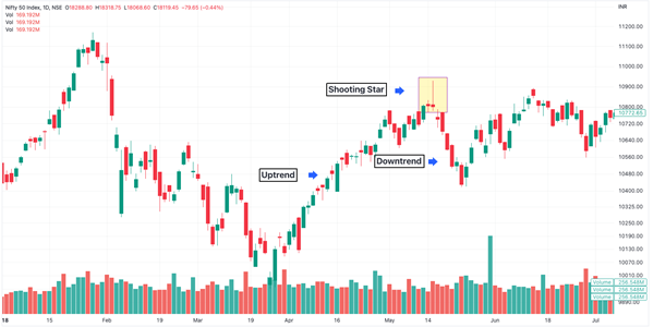
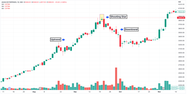
The "shooting star" pattern appears at the peak of an uptrend; its long upper wick indicates that resistance to further bullish movement has been observed above the close, and a bearish reversal is possible.
The Shooting Star, as its name implies, is a bearish reversal pattern that develops following an advance and in the star position.
Market view
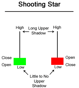
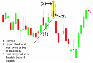
When prices open with a gap up, rise throughout the trading day, and close far from their highs, a shooting star is formed. The resulting candlestick has a small, green or red body and a long upper wick. To indicate a substantial reversal, the upper wick is relatively long and at least 2 times the length of the body. The long upper shadow suggests that buyers were able to push prices higher during the trading session, but selling pressure eventually overwhelmed them, causing prices to close near the session low. This indicates that the bullish momentum may be fading, and bears may be gaining control.
Criteria
Trade setup
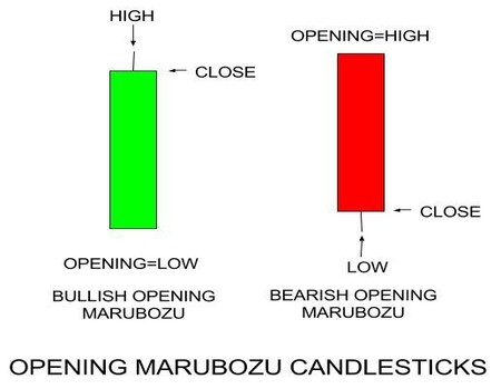
A "marubozu" represents a strong continuation of the current trend. Marubozu does not have upper or lower wicks, and the high and low are represented by the open or close.
Market view
A green Marubozu forms when open=low and close=high. This indicates that buyers controlled the price action from the first trade to the last trade. Red Marubozu forms when the open=high and close=low. This indicates that sellers controlled the price action from the first trade to the last trade.
Criteria
Trade setup
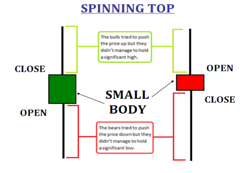
Candlesticks with a long upper wick, long lower wick, and small real body are called spinning tops and typically represents indecision in the market.
Market view
The small body (whether red or green) of the candle indicates little movement from open to close, and the wicks indicate that both bulls and bears were active during the session. Despite the fact that the trading session opened and closed with little change, prices moved considerably higher and lower in the meantime. As a result, there was a standoff because neither buyers nor sellers could gain the upper hand. A spinning top after a long green candlestick denotes the bulls' weakness and hints at a potential trend change or interruption. Similarly, a spinning top after a long red candlestick denotes the bears' weakness and hints at a potential trend change or interruption
Criteria
Trade setup
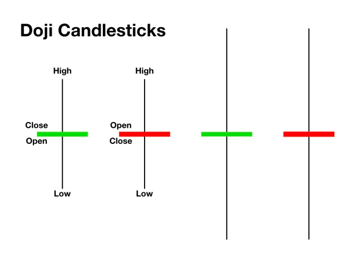
Market view
Criteria
Trade setup
In general, the length of a candlestick's body indicates the strength of the buying or selling pressure. Long candlesticks represent large price movements from opening to closing price. Short candlesticks, on the other hand, signify consolidation and show little price movement. Candlesticks with short wicks indicate that most of the trading action was confined near the open and close. Candlesticks with long wicks show that prices extended well past the open and close.
Always remember to use various candlestick patterns and indicators in order to support your research and trading strategy before buying a security.
The Three Candlestick rule is a trading strategy used to identify future price movements by examining the last three candles in a chart. It helps gauge market sentiment and potential reversals.
The x-axis on the chart represents the timeframe, which you can adjust based on the scope of your analysis (for example, you can check a 1-day chart for short-term analysis and switch to a 1-year chart for a longer-term analysis). The y-axis, on the other hand, stands for the price levels the stock touched.
Each candlestick represents the rise or fall in price of a stock in any given time period (this time period can also be adjusted). And under the pattern you can also view the degree of volume being traded at that particular time and price. The taller the bar, the higher the volume traded.
This rule requires identifying a specific candlestick pattern over a 5-day period, with the fifth candle serving as an entry and exit signal.
There’s no specific candle that can be classified as being the “best” for intraday trading. Intraday trading in itself can be profitable with the right candlesticks, but their performance is also influenced by market sentiment. To minimize risks, it's recommended to use technical indicators alongside candlestick patterns to be surer about your analysis. Oh, and don’t forget using stop-loss to minimize your risk quotient.


Copper is a widely used base metal known for its electrical and thermal conductivity, strength, ductility and corrosion resistance. It is used across electrical wiring, construction, machinery, power infrastructure and several industrial applications.
 67 views
 2 minutes
 09 Oct 2026
Copper is a widely used base metal known for its electrical and thermal conductivity, strength, ductility and corrosion resistance. It is used across electrical wiring, construction, machinery, power infrastructure and several industrial applications.
52 views
2 minutes
09 Oct 2026
Natural Gas is a widely traded energy commodity used for electricity generation, industrial activity, heating and other applications. Its prices can react sharply to weather, supply and demand, inventories, global energy markets and geopolitical developments.
268 views
1 minutes
30 Sep 2026
Elevate Your Financial Knowledge with the
ICICI Direct iLearn App
Elevate Your Financial Knowledge with the
ICICI Direct iLearn App
